New Construction / Planning Appraisal
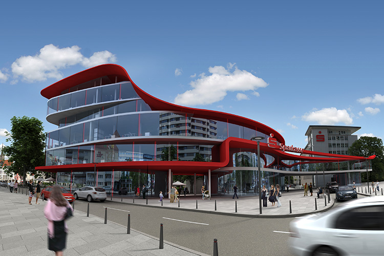
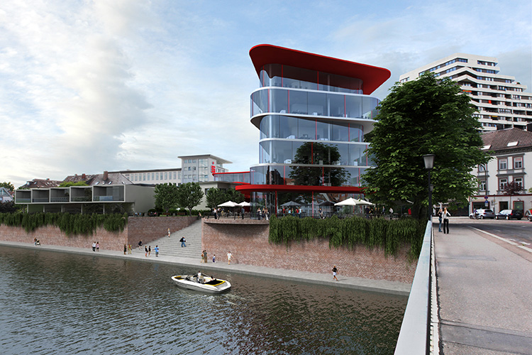
The aim of the design was to create a bridgehead to the island with the building. The building and the public space were to communicate by creating generous open spaces. The new building was intended to expand the urban space, and the building was used as a space-creating element. The traffic situation was reorganised. Access to the southern bank of the Danube was to be extended via a generous staircase. The theme of the towers was developed further; the new building was to formulate an urban landmark through the six-storey design of the structure at the bridgehead. The public space was to be redesigned by creating a sequence of squares with different characteristics as attractive stations in the neighbourhood. The curved façade leads to the central square and makes the building appear different from every angle. The Danube river acts as a defining element that also sets the building in motion and leads to different wave valleys and peaks. The façade is pronounced as an open structure and shows what is happening inside.
The building, as a distinctive structure, will have a different impact by day or night. By day, the horizontal lines are emphasized = expressing the dynamic of the river, businesses, the flow of pedestrians, the movement of vehicles, the data stream, change. By night, the vertical line will be expressed by means of small red light strips placed at uneven intervals on the building = moments of stability, relaxation, rest, thoughts and dreams and a muse with notes in varied tones. The unique corporate design of the building is also expressed through the choice of color, which is associated positively with the Sparkasse.
Planning – June 2011


